Modohouz
Modohouz
Modohouz
A digital furniture store built around space, imagery, and a shopping experience that stays out of the way.
A digital furniture store built around space, imagery, and a shopping experience that stays out of the way.
A digital furniture store built around space, imagery, and a shopping experience that stays out of the way.
A digital furniture store built around space, imagery, and a shopping experience that stays out of the way.
E-commerce · Product Design · UI/UX · Responsive Web


Shopping for furniture is visual by nature. You want to see the object, understand its character, imagine the scale, and picture it in your own space.
Shopping for furniture is visual by nature. You want to see the object, understand its character, imagine the scale, and picture it in your own space.
Shopping for furniture is visual by nature. You want to see the object, understand its character, imagine the scale, and picture it in your own space.
Shopping for furniture is visual by nature. You want to see the object, understand its character, imagine the scale, and picture it in your own space.

Project Overview
Project Overview
Project Overview
Project Overview
I kept the visual language deliberately restrained.
Neutral tones create the backdrop. Typography provides structure. Large-scale imagery brings personality. UI elements stay functional and understated.
The result is an interface that behaves more like a well-designed interior: everything has a place, and nothing is there just to fill space. The neutral palette and prominent product imagery are also central to the original Modohouz presentation.
I kept the visual language deliberately restrained.
Neutral tones create the backdrop. Typography provides structure. Large-scale imagery brings personality. UI elements stay functional and understated.
The result is an interface that behaves more like a well-designed interior: everything has a place, and nothing is there just to fill space. The neutral palette and prominent product imagery are also central to the original Modohouz presentation.
The Challenge
The Challenge
The Challenge
The Challenge
Make browsing feel less like browsing.
Make browsing feel less like browsing.
Make browsing feel less like browsing.
The challenge wasn’t adding more functionality. It was deciding what could disappear.
The experience needed to make a large catalogue easy to explore while keeping the furniture—not the interface—as the strongest thing on every screen.
Clear hierarchy, simple navigation, generous space, and strong photography became the foundation.
The challenge wasn’t adding more functionality. It was deciding what could disappear.
The experience needed to make a large catalogue easy to explore while keeping the furniture—not the interface—as the strongest thing on every screen.
Clear hierarchy, simple navigation, generous space, and strong photography became the foundation.


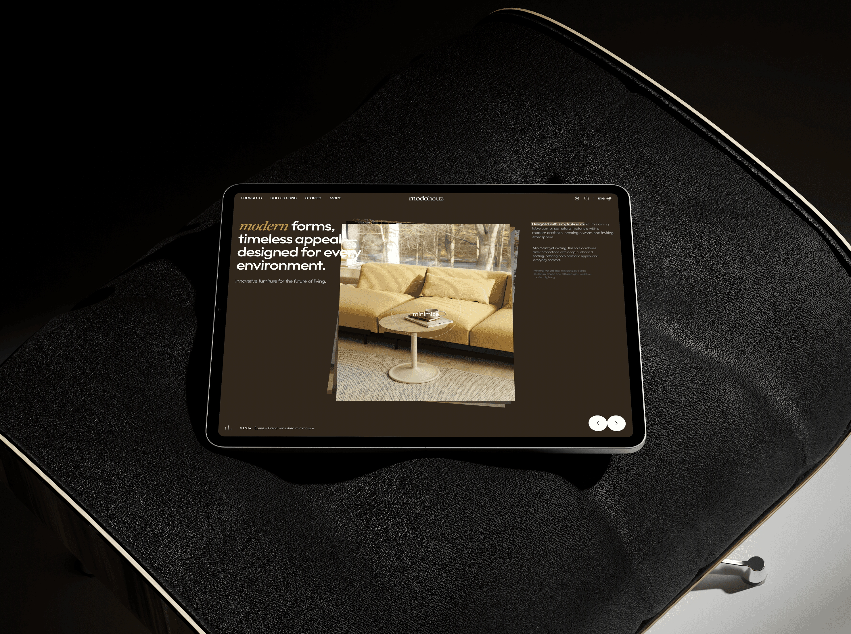
Details / UI
Details / UI
Details / UI
Details / UI
A restrained interface puts more pressure on the details.
Spacing, type scale, image proportions, controls, states, and alignment have to do more of the work when there isn't much decoration to hide behind.
That became one of my favorite parts of the project.
Outcome
Outcome
Outcome
Outcome
A store that feels more like a space.
A store that feels more like a space.
A store that feels more like a space.
Modohouz became an exploration of what happens when an e-commerce experience stops competing with what it sells.
Less visual noise.
More room for the product.
Fewer decisions around the interface.
More attention on the furniture.
Collaborated with leading companies like Uber and Valve, delivering cutting-edge design solutions.
nicholasui.design@gmail.com
dribbble
behance
Collaborated with leading companies like Uber and Valve, delivering cutting-edge design solutions.
nicholasui.design@gmail.com
dribbble
behance
Collaborated with leading companies like Uber and Valve, delivering cutting-edge design solutions.
nicholasui.design@gmail.com
dribbble
behance
Collaborated with leading companies like Uber and Valve, delivering cutting-edge design solutions.
nicholasui.design@gmail.com
dribbble
behance
Collaborated with leading companies like Uber and Valve, delivering cutting-edge design solutions.
nicholasui.design@gmail.com
dribbble
behance
Collaborated with leading companies like Uber and Valve, delivering cutting-edge design solutions.
nicholasui.design@gmail.com
dribbble
behance